
Construction Company Logos Built for Trucks, Not Templates
Your business is your legacy, and we treat it like ours. We build the logo, the branding and the entire ecosystem behind it, all working together to win you more jobs and make you the best looking company in your town. Scroll the wall below. The work speaks for itself.
Real client work · 45 brands · Zero stock art


Every list of construction company logos on the internet shows you the same thing: templates nobody owns, mocked up for companies that do not exist. This page is different on purpose. Below is the entire wall, 45 real construction company logo and brand designs our team built for actual businesses, the kind that end up wrapped on a truck, stitched on a crew shirt and staked in a front yard. Tap any of them to see it up close. Study what makes them work, treat the four styles further down as construction logo ideas for your own direction, and if you are still picking the name that goes under the mark, start with our construction company names guide first.
45 Construction Company Logos We Designed for Real Clients


Print it anywhere. Every file, delivered.
Your logo arrives ready for the real world. Vector source files for the wrap shop and the sign maker, transparent files for your website and estimates, print ready files for everything on paper, and one color versions for embroidery. No chasing your designer for formats six months later.
- Truck wraps
- Business cards
- Flyers
- Brochures
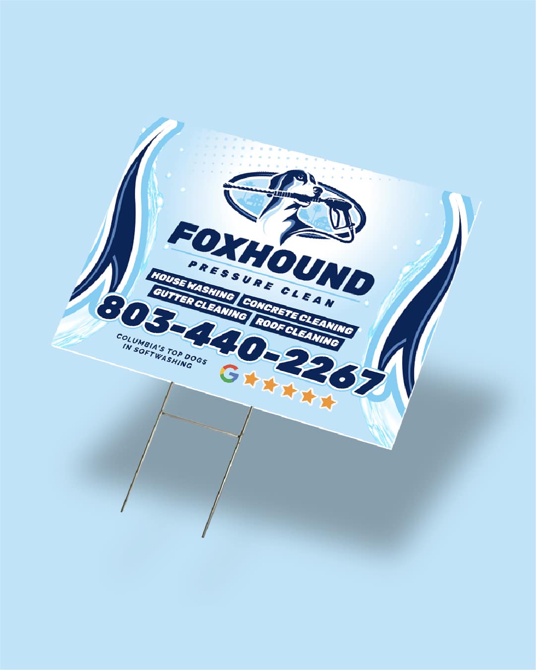
- Yard signs
- Embroidery
- Website


Pair your logo with brochure design.
The logo is step one. We design the brochures, flyers and leave behinds that carry it, so every piece a customer touches looks like it came from the same serious company. Hand over a matching brochure after the estimate and you instantly look bigger, sharper and more established than the competitor who left a business card from a gas station printer.

One mark. Everywhere your customers look.

The complete kit, not a lone file
A logo sitting in an email is not a brand. Our clients walk away with the mark already applied across their materials, so the business looks finished from day one instead of pieced together over a year.
Consistency is what makes you look big
When the truck, the card and the shirt all match, every sighting reinforces the same company. That repetition is how a two crew operation starts reading like the biggest name in town.

Follow one build from the mark to the street.
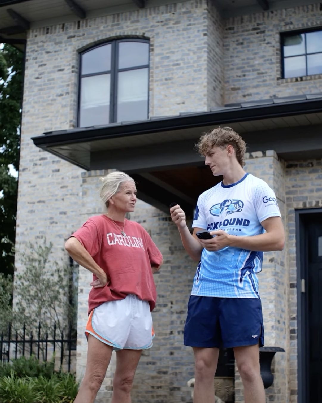
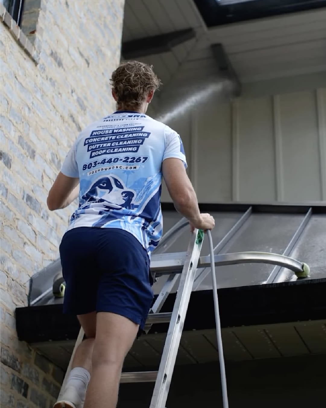
The wall shows range. This shows depth: a single client brand carried through every application, so you can see exactly what working with us produces. Tap any image to look closer.



Construction Logo Styles and Who Each One Wins
Almost every strong construction company logo lands in one of four personalities. Pick the one that matches the customer you want, because they pull differently. You will spot all four in the wall above.
Strong badges and emblems
Shields, hexagons and heavy shapes that read as durability. The logo should hit like the work does.
Best forRenovation, demolition, concrete and heavy construction.
Classic and trusted marks
Circles, cornerstones and compass points, built to age well instead of chasing a trend.
Best forFamily companies and general contractors selling reliability and years in business.
Modern and minimal
Clean geometry, negative space and confident type that photographs well on every screen.
Best forDesign build firms and companies courting architects, designers and younger homeowners.
Luxury and custom home
Thin lines, gold accents, quiet confidence. Built to look right on a gate post in the best neighborhood in town.
Best forCustom home builders and high end remodelers.
What Makes a Construction Logo Actually Work
Your logo's biggest billboard drives 45 miles an hour. If the name is not legible from across an intersection, the design failed no matter how nice it looks on a screen.
Embroidery, yard signs, invoices and steel stamps all happen in a single color. If the mark falls apart in plain black, it is a picture, not a logo.
Hard hats, crossed hammers and generic rooflines are the first idea everyone has, which is exactly why they make nobody memorable. Build from your name, your initials, a mascot or a shape only you own.
A heavy badge pulls demolition and renovation work. A thin gold seal pulls custom home clients. Design for the jobs you want more of, not the ones you already have.
The test is brutal and fair: if a customer cannot roughly sketch your logo an hour after seeing your truck, it is carrying too much detail.
The Checklist Before Anything Gets Wrapped
- 01Search it first. Google your company name plus logo and scan image results, so you are not accidentally twins with a company two states over.
- 02Check the trademark database. A five minute search at USPTO.gov for your name and mark beats redesigning after the trucks are wrapped.
- 03Get the vector files. SVG, AI or EPS scale to any size, and they are what your wrap shop and embroiderer will ask for. Every logo we deliver includes them. If a past designer only handed you a JPG, that job was never finished.
- 04Print it tiny and far. Shrink it to business card size and view it from across the room. Both tests kill overdetailed designs fast.
- 05Put it everywhere at once. Truck, website, estimates, Google profile, shirts. Consistency is what turns a mark into a brand, and it feeds the recognition that makes SEO for construction companies convert better.
Construction logo questions, answered.
What makes a good construction company logo?
Four tests decide it. It reads at truck speed, meaning the name is legible from across a parking lot and at highway distance. It survives one color, because a logo that only works in full color fails on embroidery, yard signs and invoices. It matches the work you want, since a heavy badge pulls different customers than a thin luxury mark. And it avoids the cliches every competitor already uses, the hard hat, the crossed hammers, the generic roofline, unless you can execute them better than everyone in your market.
How much does a construction company logo cost?
The market runs from free to thousands. Free generators like Canva templates produce something usable but generic, and you will eventually meet your own logo on someone else's truck. Freelance designers commonly run from a hundred to a thousand dollars depending on experience, and branding agencies charge multiples of that. The honest advice: the logo matters less than the consistency. A decent mark used everywhere beats a beautiful one used nowhere, and at PRceptive logo work is part of the brand build that comes with the websites we design for contractors.
What colors are best for a construction logo?
Pick from what the trade already trusts, then add one twist. Black, charcoal and navy read as strength and reliability. Construction yellow and safety orange read as energy and job site heritage, best as an accent rather than the whole identity. Deep greens and earth tones fit builders who want an established, grounded feel, and gold accents signal luxury and custom work. The practical rules: two colors maximum, make sure it works in pure black, and check it against the competitors in your town so your trucks do not disappear into theirs.
Should my construction logo include a hammer or hard hat?
Usually no, and the reason is math. Tools and hard hats are the first idea everyone has, which means thousands of construction companies already wear them, and a logo built from the most common idea in the industry cannot make you memorable. Strong alternatives that still say construction: structural shapes like beams, frames and rooflines, a bold monogram of your initials, a badge built around your founding year, or a mascot or mark drawn from your name itself. If you truly want a tool in the logo, abstract it until it becomes a shape only your company owns.
What file formats do I need for my logo?
One rule above all: get the vector files. A vector version, usually SVG, AI or EPS, scales to any size without blurring, which is what your truck wrap shop, sign maker and embroiderer will ask for. From the vector, everything else gets exported: PNG with a transparent background for the website and documents, a square version for social profiles, and a one color version for single color printing. If a designer only hands you a JPG, the job is not finished, and redrawing a logo from a JPG later costs more than doing it right the first time.
The logo is the handshake. The website closes.
You just scrolled 45 reasons to trust us with yours. PRceptive builds contractor brands end to end: the logo, the website at no upfront cost, and the Google rankings that put both in front of your town.
No contracts · No setup fees · 100% money back guarantee
Esc to close · arrow keys to browse · click outside the logo to exit